Gate Experience Concept
Reimagining Alaska Airlines’ gate experience with people-first concepts that connect the needs of travelers and agents.
Client: Alaska Airlines (via This Place)
Role: UI/UX designer among 7 other team members
Timeline: 4 Weeks
Tools: Pen/paper/post-it notes, Figma, Keynote, Protopie
Overview
Alaska Airlines, a Seattle institution with roots dating back to the 1930s, asked us at This Place to reimagine the airport gate experience in just four weeks. Despite strong customer loyalty, their gates and boarding experience remain confusing, uncomfortable, and operationally focused rather than people-centered. Our challenge was to identify opportunities, both physical and digital, that could improve the gate journey for travelers and gate agents alike.
The challenge
Problem
The gate experience is designed primarily for operations, not people. Our research surfaced three key pain points:
Airports, especially gates, are confusing to navigate for even for seasoned travelers.
Both travelers and gate agents struggle to use their time efficiently with the information currently provided.
Gates are uncomfortable and uninviting spaces for everyone.
Goals
Identify primary pain points through discovery and map out along a user journey.
Identify seamless physical and digital opportunities for positive interactions between guests and agents.
Design a gate experience that works for all travelers, not just frequent flyers.
Timeline
Week 1: Discovery
Prepare a research plan and tools before dividing up to conduct desk research and send out surveys, and conduct in-person interviews and observations.
Week 2: Synthesis
Coming back together for all-team insight analysis, the first version of the user journey map, proposed feature prioritization, and early design ideation.
Week 3: Client Workshops
Workshopping the user journey, feature list, and wireframes with the client. Cascading work, as it is decided upon, is then taken by smaller teams and individual designers.
Week 4: Polish & Pitch
Final high-fidelity designs are produced and prototyped, user stories are written, and final presentation assets are prepared and presented.
Research scope
90 travelers surveyed
20 stakeholders interviewed

60 analogous & competitive research pieces


7 airports observed
20 Gate Agents interviewed
My contributions
I contributed directly to the research strategy, delegating and deciding how research was prioritized, conducted, and synthesized among 7 co-contributors. I created printed worksheets so that each team member was able to have the same structure of observations, streamlining research synthesis. I observed 3 airport gate experiences and shadowed gate agents at 2 airports.
Once research was completed, I co-facilitated an in-person workshop with the airline, locking in insights and a primary direction with which we could iterate designs around. Once this direction was decided, I created the high-fidelity designs for the guest mobile experience.
Guiding Insights

Visibility & Communications
Airports and gates remain deeply confusing places, even for the most seasoned travelers.
Time & Efficiency

Everyone wants to make the best use of their time, whether they have too much, or too little.
Empathy

Gates are uncomfortable, unfamiliar & uninviting spaces for everyone.
Brand Differentiation

Gate Agents wish they had more time to surprise & delight guests.
The Solution
User Journey
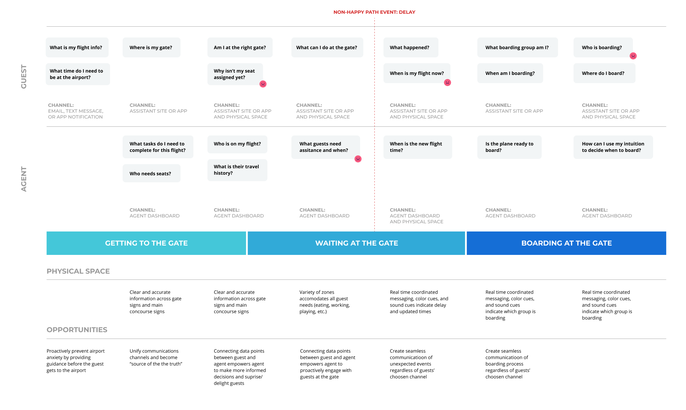
Alaska approached us with a robust guest user journey, but it lacked employee experience and pain points. Based on our discovery, we folded in the gate agent experience across three phases of the user journey where they align with the guest experience: Getting to the Gate → Waiting at the Gate → Boarding at the Gate.
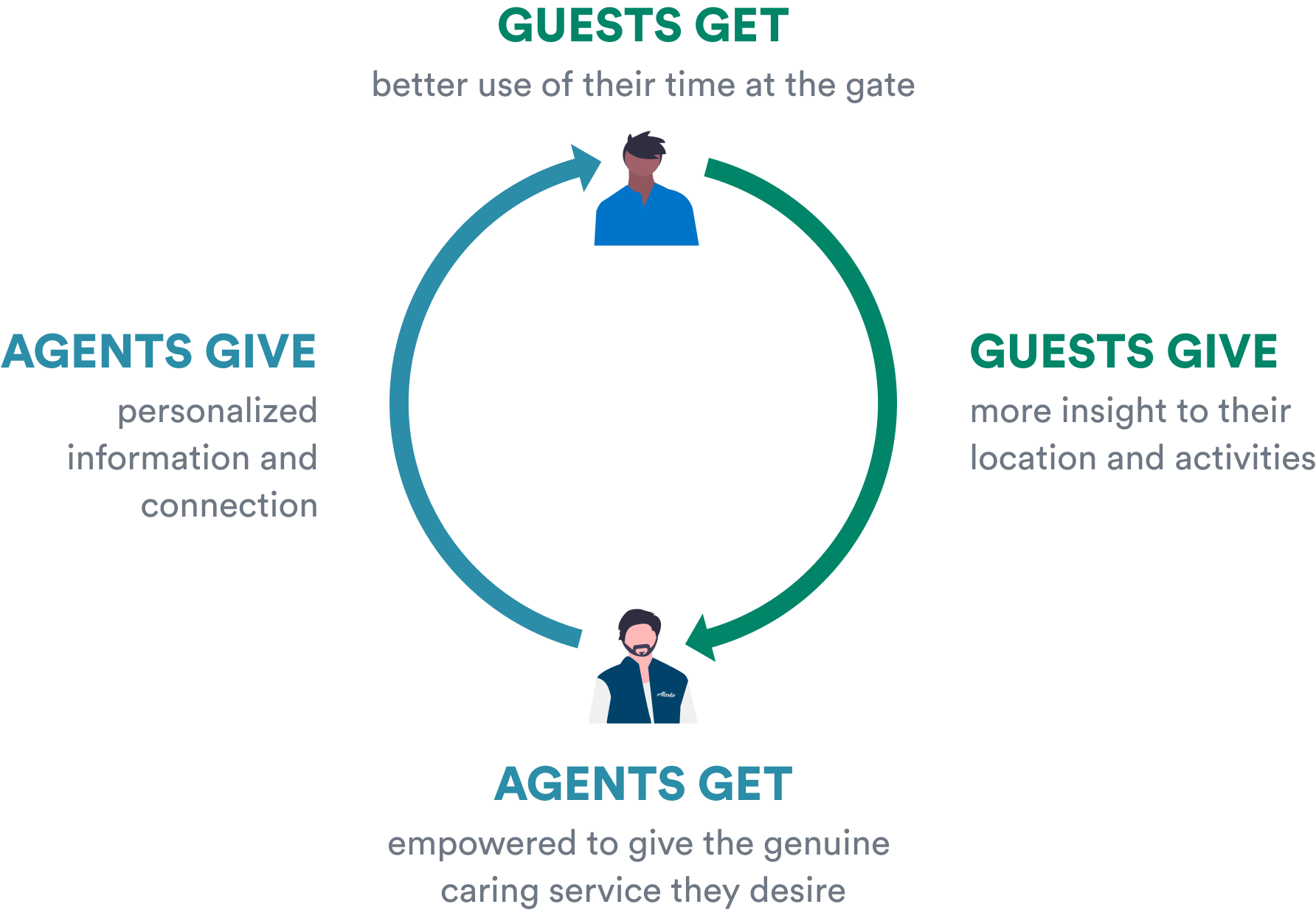
We uncovered what we called the Benefit Loop: improvements for travelers simultaneously reduce burdens on agents, creating space for positive interactions. As guests become more informed at the gate, there is less need for assistance. As there is less need for assistance, agents are freed to perform flight tasks and delight guests. This is powered by digital technology and the design of the physical space.
We see this loop being realized across 3 touchpoints: App agnostic mobile experience, Gate Agent Dashboard, and Smart Gates.

Getting to the Gate: App-Agnostic Assistant
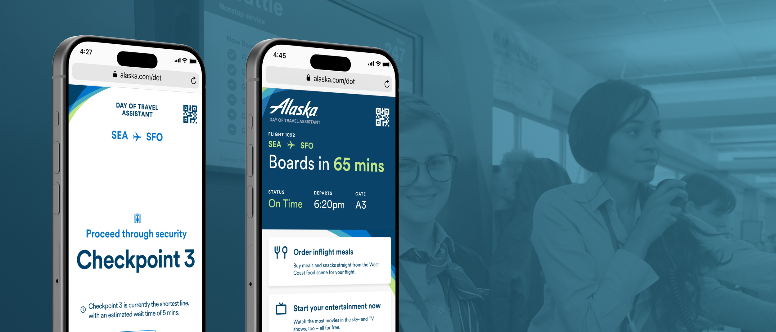
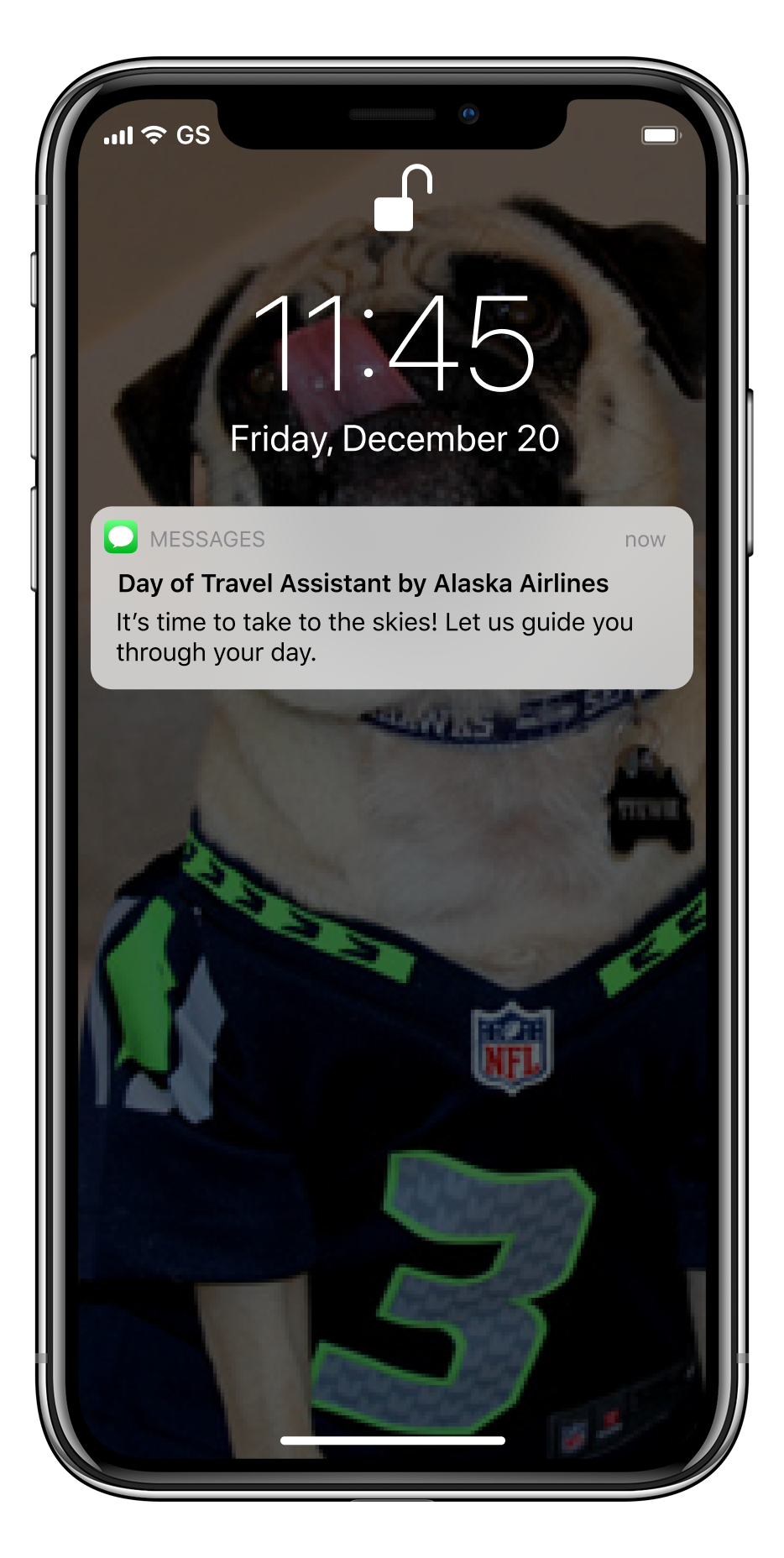
The final mobile experience as part of this vision of the future is a day of a travel assistant, guiding the guest through their experience from when they check their phone at home to getting off the plane.
![iphone safari screen reading "Alaska Day of Travel Assistant. SEA to SFO. Your Flight will be leaving from Terminal 2. Arrive at the airport by 4:20pm. [Next button]"](https://images.squarespace-cdn.com/content/v1/5840f93d197aeaf4985b1205/17533e39-bb49-48ca-afe1-9f716579c854/Guide-1.png)
![iphone safari screen reading: "Alaska Day of Travel Assistant. SEA to SFO. Proceed through security Checkpoint 3. Checkpoint 3 is currently the shortest line, with an estimated wait time of 5 mins. [Next Button]](https://images.squarespace-cdn.com/content/v1/5840f93d197aeaf4985b1205/3c78ec6b-5fb8-4fdb-aa7a-cd25878041f5/Guide-2.png)
Simple guides
Personal, turn-by-turn navigation cuts through the noise of competing screens and announcements
![iPhone safari page with center modal: "Don't worry about overhead space, we've got you covered. Just drop your bag off with Harold and get it back at your gate in SF. You can track your back right here in the Day of Travel Assistant. [Check Bag]"](https://images.squarespace-cdn.com/content/v1/5840f93d197aeaf4985b1205/0a9dc2e4-ba08-446e-98a9-cde9c5e40cce/Overhead-Bins.png)
![Iphone safari page with footer modal: "Your flight has been delayed by 60 mins. Sit back, rela, and grab a coffee on us. [Redeem button] [No, thanks button]"](https://images.squarespace-cdn.com/content/v1/5840f93d197aeaf4985b1205/f212a7a1-af93-42e8-a290-5e4e0e81ac7d/Delay.png)
Gate-side information
Provides reassurance through consistent and up-to-date flight information. Socializes in-flight amenities, such as food and entertainment, that the guest can purchase and start ahead of their flight. Provides information on baggage check-in and timely messaging around delays and other flight changes.
Waiting at the Gate: Real-time Information

Boarding: Clear Information
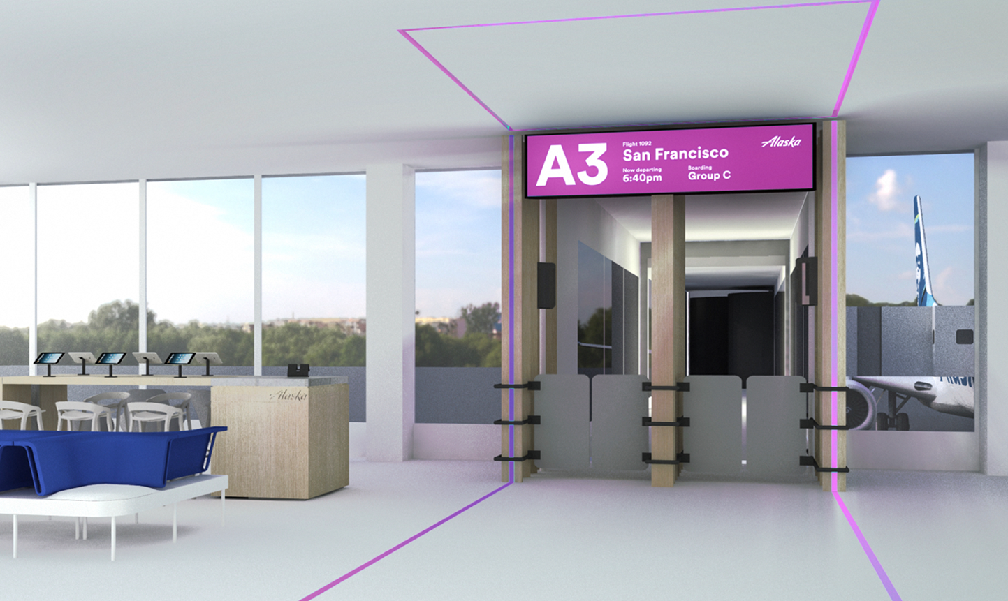
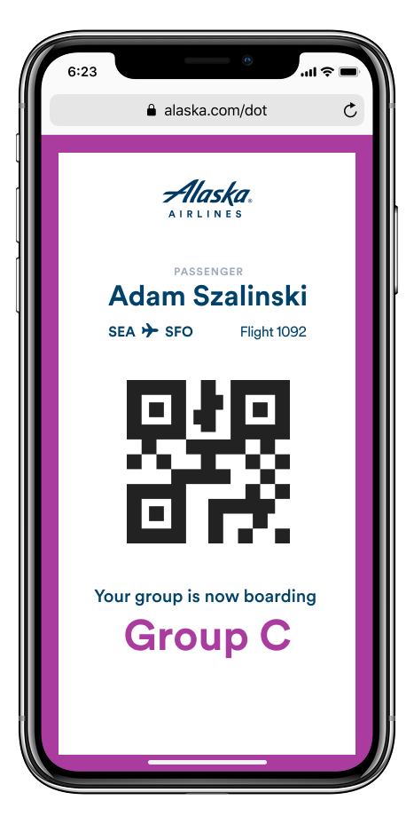
Omni-Channel boarding signals
Boarding colors and sounds coordinate visibly in the app and across gate signage, leaving no room for ambiguity.
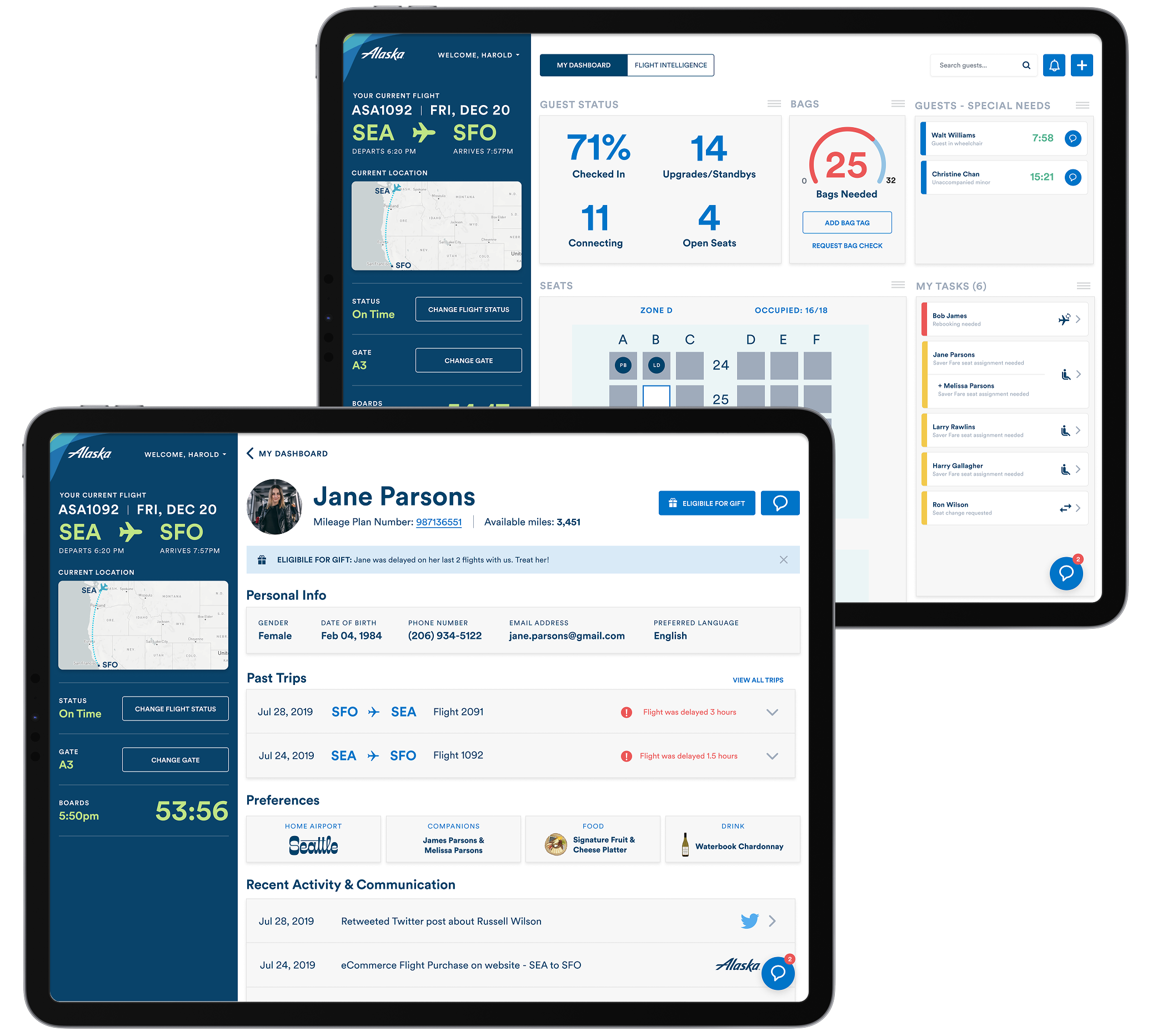
Giving greater control to agents through greater visibility and control of information & workflows.
This experience curates the best of Alaska Airlines tools and process into a customized dashboard agents can utilize on the job. An analytics layer provide real time flight & guest insights to enable them to provide the best service possible to guests.
Enhanced gate agent experience
Outcome
This work was well received by Alaska Airlines, where it helped inform the next generation of their tools and led to further work generated by the agency (which happened after I left the agency).
A retrospective note: this work was completed in Winter 2019, before the AI explosion in human-computer interface design. There are many ways in which emerging Agentic AI applications would streamline the connected task flows of both Alaska guests and the gate agents, especially around seat assignments, learning guest preferences, and optimizing around delay events and responses.
